The Nothing Phone (2) is truly something special. It has taken a phone that was essentially all-looks-no-substance and turned it into a well-rounded device with looks and utility to match. Not just that, Nothing OS 2.0 is possibly one of my absolute favourite mobile phone operating systems – it looks distinguished, classy, and clean while being fluid all the way through. The performance has improved vastly and battery life is superb as well. Now, for the price tag of ₹44,999 going all the way up to ₹54,999, the phone may seem overpriced to some. The Snapdragon 8+ Gen 1 is present on much cheaper phones such as the iQOO Neo 7 Pro and the camera stack is nothing to write home about.
Nothing. It’s too early to award this brand “legendary” status – which the likes of Apple, Samsung, and Google have gotten over the years – but it definitely looks like it's on the way. The genius of Carl Pei’s marketing combined with the idiosyncratic design characteristics of Nothing products lead to these gadgets being some of the most hyped to ever exist. And “nothing” (heh) changed with the new Nothing Phone (2). Whether it is appreciation for the newer features of the Phone (2) or disapproval due to the similar design cues, the Nothing Phone (2) is making headlines. The similarity in the design compared to the Nothing Phone (1) (review) may disappoint some, but one cannot deny the Phone (2) has improved specs almost all the way across the board. However, this comes at quite a steep price hike. So, is the Nothing Phone (2) worth it or is it “nothing” special? The headline may have given the plot away, but let’s delve deeper.
Nothing Phone (2) Review: Build and DesignThe Nothing Phone (2) could easily be confused for the Phone (1) at first glance. The Nothing Phone (2) is available in two colours – White and Dark Grey. I got the latter for review and this is just slightly darker in colour when compared to the black-coloured Phone (1). Something I’d like to point out is that the Phone (2)’s retail box uses no plastic at all, which is commendable. However, to be opened, the box needs to be torn, which is a bit jarring for me, since I usually preserve my smartphone boxes.
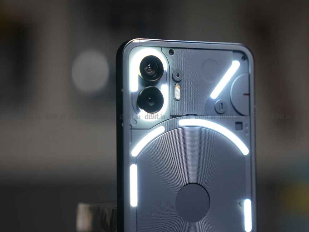
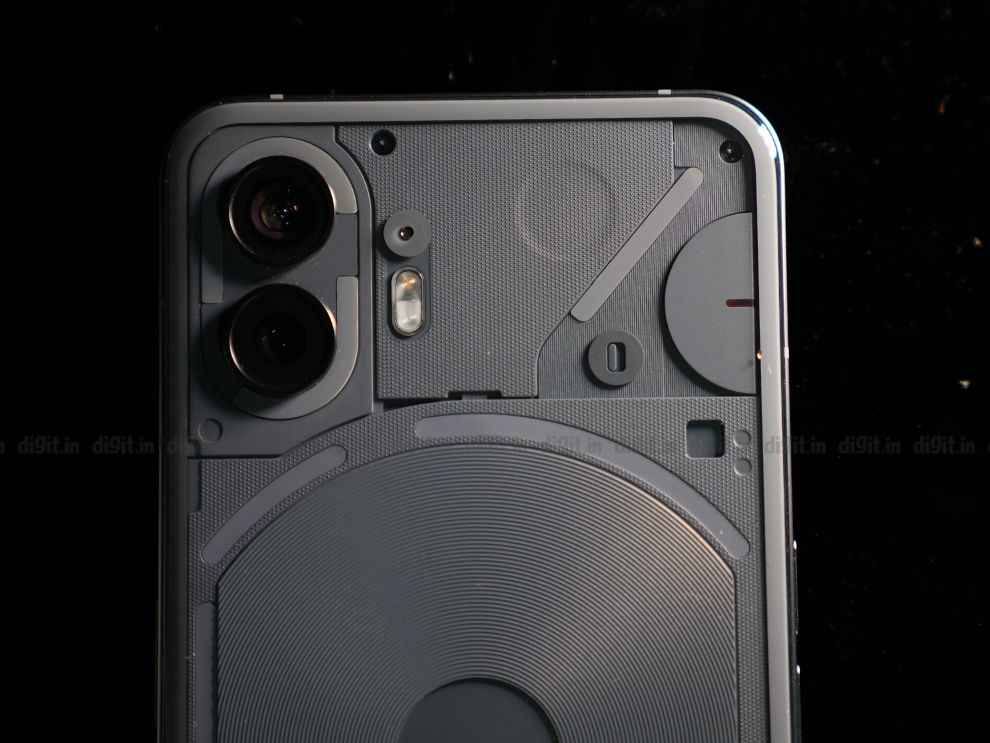
The Phone (2) has a thin aluminium frame with transparent glass on the back. It is 8.6 mm thick and weighs 201.2 g – not too bad. The biggest change in design when compared to the Phone (1) is the curved rear glass. It is protected by Gorilla Glass (but Nothing hasn’t disclosed the version). I’m glad Nothing went for the curved glass approach over the complete flat look, since it is not only nicer to look at, but also more comfortable to hold.
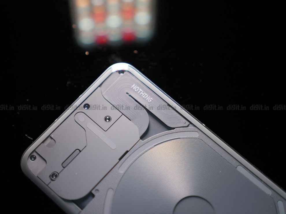
Behind the transparent rear panel, you can see the entire Glyph system with the same design as before, but now, broken up into smaller segments. The components inside are neat and look lovely, you will see a few exposed Torx screws and a bunch of panels hiding the innards. No inconsistent glue work and no unsightly wires – just pure art. In my opinion, at least.
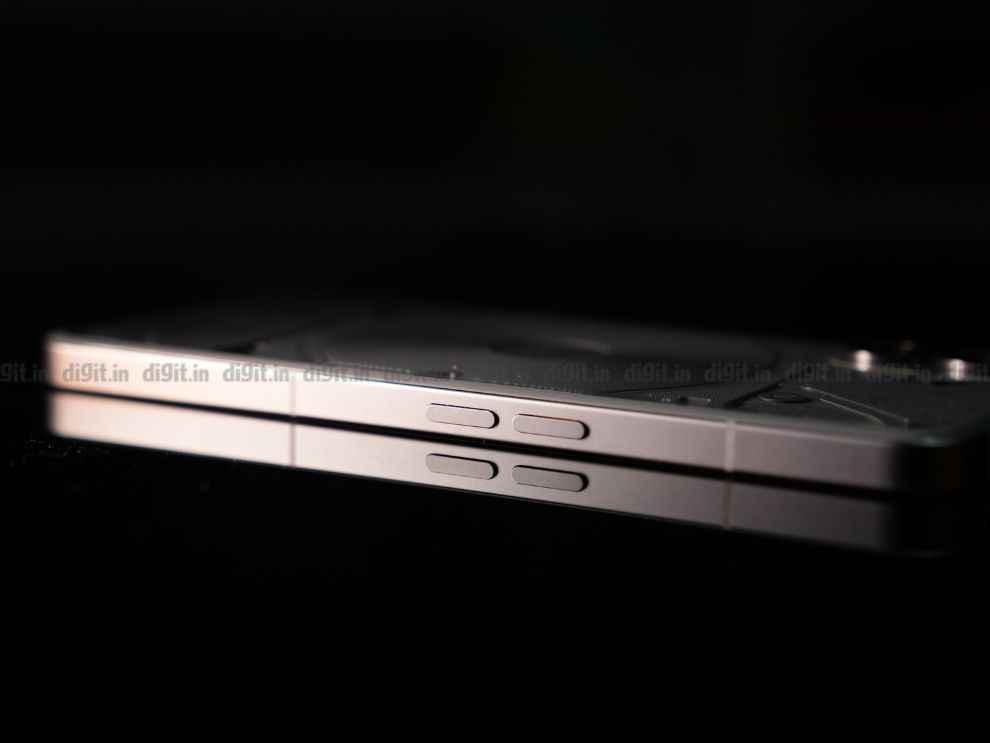
The Nothing Phone (2) stands out in a sea of similar-looking smartphones. And while it has garnered some criticism for playing it too safe with the design (owing to how similar it looks compared to the Phone (1)), it is intentional. Nothing wants to establish this look in users’ minds to ensure that when anyone sees a Phone (1) or (2), there’s no mistaking that it comes from the house of Nothing.
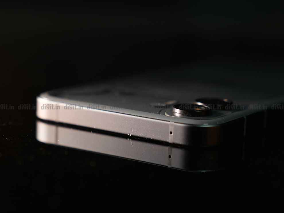
There’s personality, for sure. Whether you call the glyphs a gimmick or not, it is eye-catching, no doubt. It has that industrial flair that I’m a big fan of. And the rest of the build, including the gentle curve of the rear glass panel, the brushed aluminium frame, and the lovely symmetrical bezels, all look top-notch and premium. The Phone (2), however, is only IP54 rated which is slightly disappointing since it still can’t survive a submersion.
Nothing Phone (2) Review: DisplayTucked in between those gorgeous symmetrical bezels is a 6.7-inch LTPO OLED FHD+ display with a peak brightness of 1,000 nits. It can reach up to 1,600 nits in HDR video playback. It supports 10-bit colour and HDR10+ as well. The screen is, once again, protected by an unknown version of Gorilla Glass. The LTPO display, in theory, can vary the refresh rate all the way from 1 Hz up to 120 Hz to conserve battery life, however, I have never seen it drop below 10 Hz in about 5 days’ worth of usage.
What’s even more appalling is that the display bumps up the refresh rate to 120 Hz on the Always-On Display, which is just ridiculous. I used Android’s native refresh rate indicator to check this. I even tried leaving it on for several minutes to see if it lowers the refresh rate after a while, but it just doesn’t. Bewildering and obviously, bad for your battery life, which is why I turned it off permanently. I hope Nothing can fix this issue with a software update in the future.
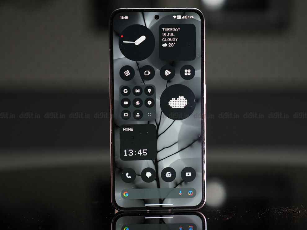
The display houses a small centred cutout for the selfie camera and there’s also the earpiece grille above the screen that doubles as the second speaker. There’s an optical fingerprint sensor beneath the screen and it was decently fast during my testing period.
The display is quite bright for the price. I recorded 988 nits of peak brightness on Auto Brightness mode and 506 nits when I cranked up the brightness to max manually. Screen legibility is excellent in sunlight and the viewing angles are impressive too. The display supports DCI-P3 and sRGB colour spaces and it looks very vibrant when watching HDR content on YouTube. Netflix did not detect it as HDR-capable, sadly. All-in-all, a vivid and bright display but the adaptive refresh rate issue is slightly concerning.
Nothing Phone (2) Review: Glyph InterfacePossibly the biggest driver for sales of the Nothing Phone (2), the glyph interface is now far more beefed up than the original version on the Phone (1). Firstly, the number of LEDs have gone up and the new Glyph Interface now comes with 33 addressable LED zones compared to 12 on the Phone (1). There’s also an Auto-Brightness feature for the LED lights now, which was much needed on the Phone (1) and I’m glad Nothing has brought it to this next iteration.
Now, in our review of the Phone (1), the reviewer said, “The Glyph interface is pretty bare bones and doesn’t have much room for customization yet but I’m very interested in seeing how Nothing develops it further, maybe even opening it up for third-party developers.”
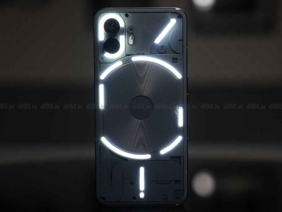
Thankfully, that’s exactly what’s happened with the Phone (2). There’s more customisation than ever before with new features and third-party app integrations that make it more of a utility than a gimmick. There’s also lots of fun to be had with some of the new features.
Let’s address all the functions. There’s 10 new ringtones and notification sounds, but if that doesn’t satisfy you, Nothing has added a Glyph composer this time around. You can create a fully custom ringtone in this app by tapping different pads that trigger different LED zones and sounds. Once you’re happy with the rhythm, you can simply record the sequence and use this Glyph tone composed by you for any of your contacts! We played with this for hours, composing our own masterpieces, trying to one up each other at the Digit test centre!
Nothing has also added Essential Glyph Notifications. So, if you want to avoid distractions but still be notified by what’s really important to you, you can select particular apps or contacts that will be able to get through to you when others won’t disturb you. So, if your phone is on silent, everything else will not light up the LED lights on the back, but messages/notifications from your selected apps and contacts will light up one of the LED areas persistently, so you don’t miss the updates deemed most important by you. There’s also a Flip to Glyph feature that auto-silences the phone in an instant when you place it screen down.
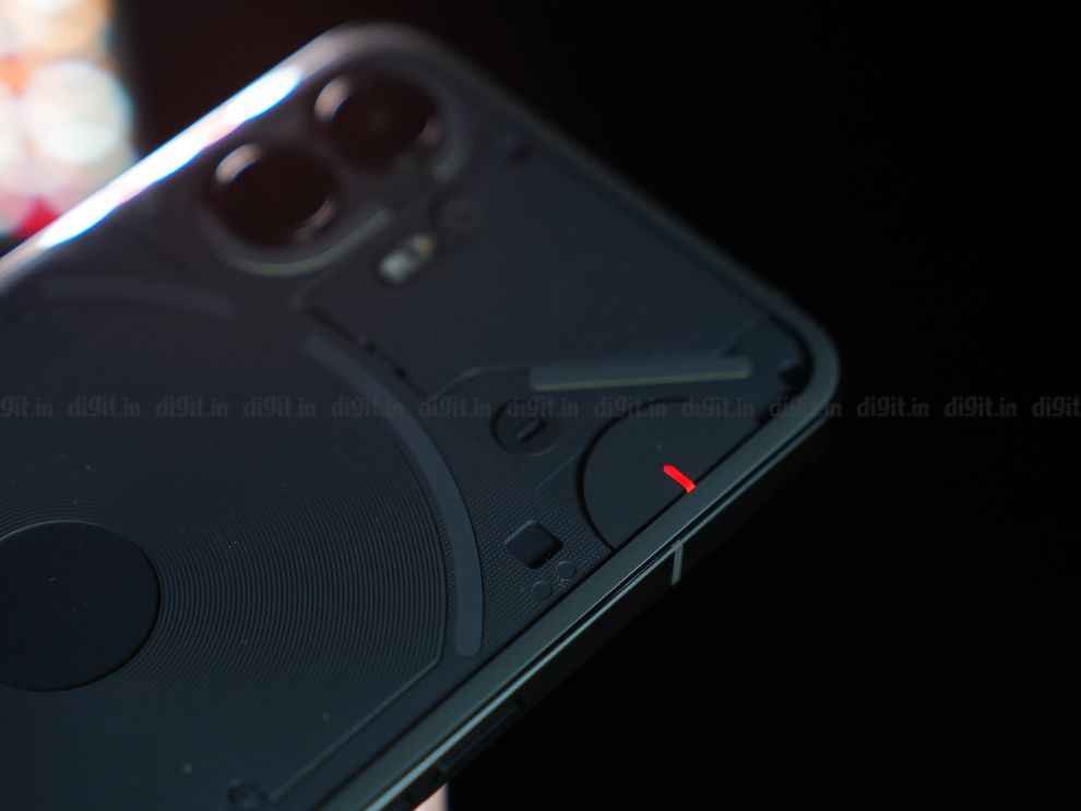
The glyphs also indicate your volume levels, charging levels, and timer progress. Of course, you can use them as a portable ring light through your camera app as well. What’s most exciting is the third-party app integrations we’ve got this time around. For now, two apps have been added – Uber and Zomato. An LED segment acts as a progress bar for your Uber and food deliveries, so you can see exactly how far your ride or your food is from you. All without turning on the display.
With the Phone (1), the glyphs were very superficial – only existing for the wow factor, without real utility. The Phone (2) has flipped the narrative. The glyphs have a purpose – and that is to disconnect and disengage from the constant act of checking your phone. It is attempting to provide a way to be more present in the moment while still keeping tabs on important information that we’ve come to expect our phones to provide us. Yes, I love the improvements to the Glyph Interface. But is it complete? No, not even close. There could be a LOT more functionality added, but it feels like Nothing has taken several steps in the right direction with the Nothing Phone (2).
Nothing Phone (2) Review: PerformanceThe Phone (2) has seen a considerable price bump, but not without some serious hardware upgrades. One of these upgrades is the processor. The Phone (2) is powered by the Qualcomm Snapdragon 8+ Gen 1 processor, an undeniable improvement over its predecessor’s mid-range Snapdragon 778G+ SoC. You get up to 12 GB LPDDR5X RAM and up to 512 GB UFS 3.1 storage. This ensures that the performance is more akin to flagships. That’s corroborated by most of the synthetic benchmarks I ran.
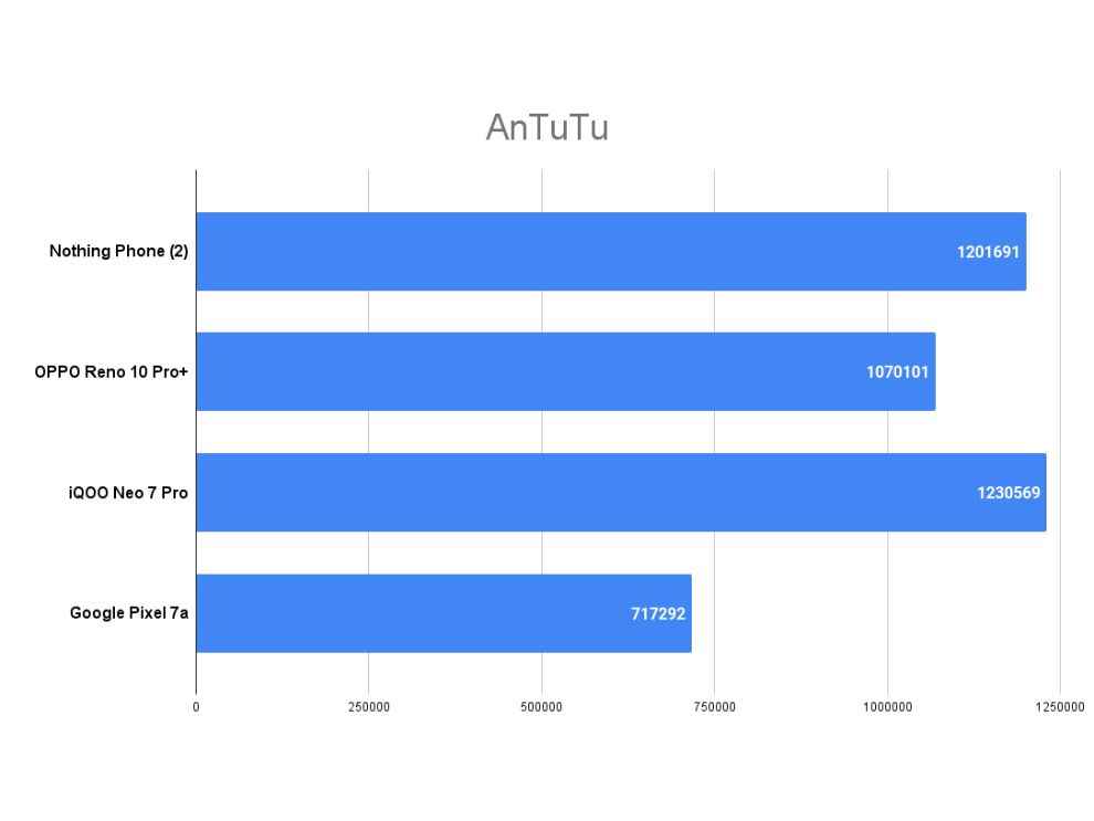
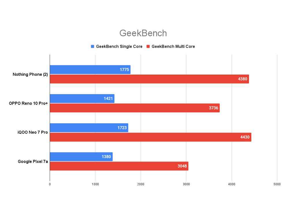
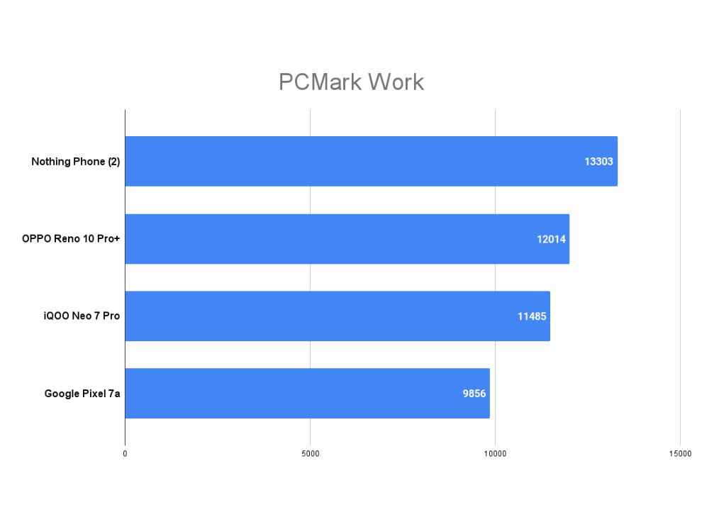
In AnTuTu, the phone scored more than 1.2 million, easily beating out phones such as the Google Pixel 7a and OPPO Reno 10 Pro+. In fact, its score is very close to the flagship Galaxy S23 Ultra (review) as well! In GeekBench, the phone flew past the scores of the Pixel 7a (review) and OPPO Reno10 Pro+ (review) once again, but the iQOO Neo 7 Pro (review) – which is much cheaper – managed to squeak out slightly better scores in some CPU tests. Not in PCMark Work though, where the Nothing Phone (2) beat out all three phones.
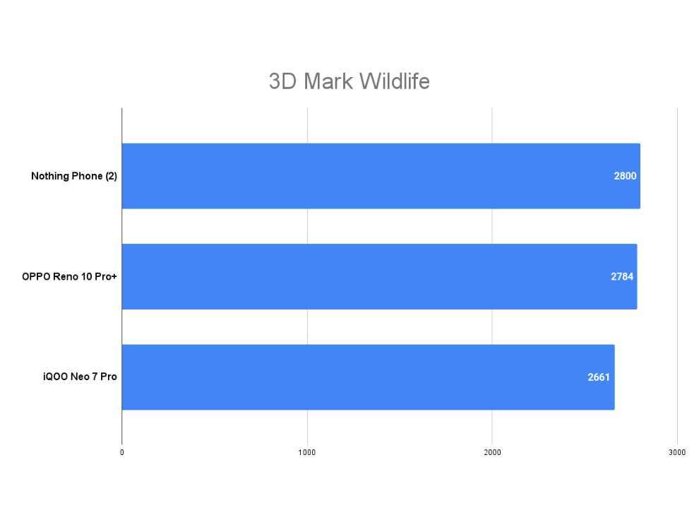
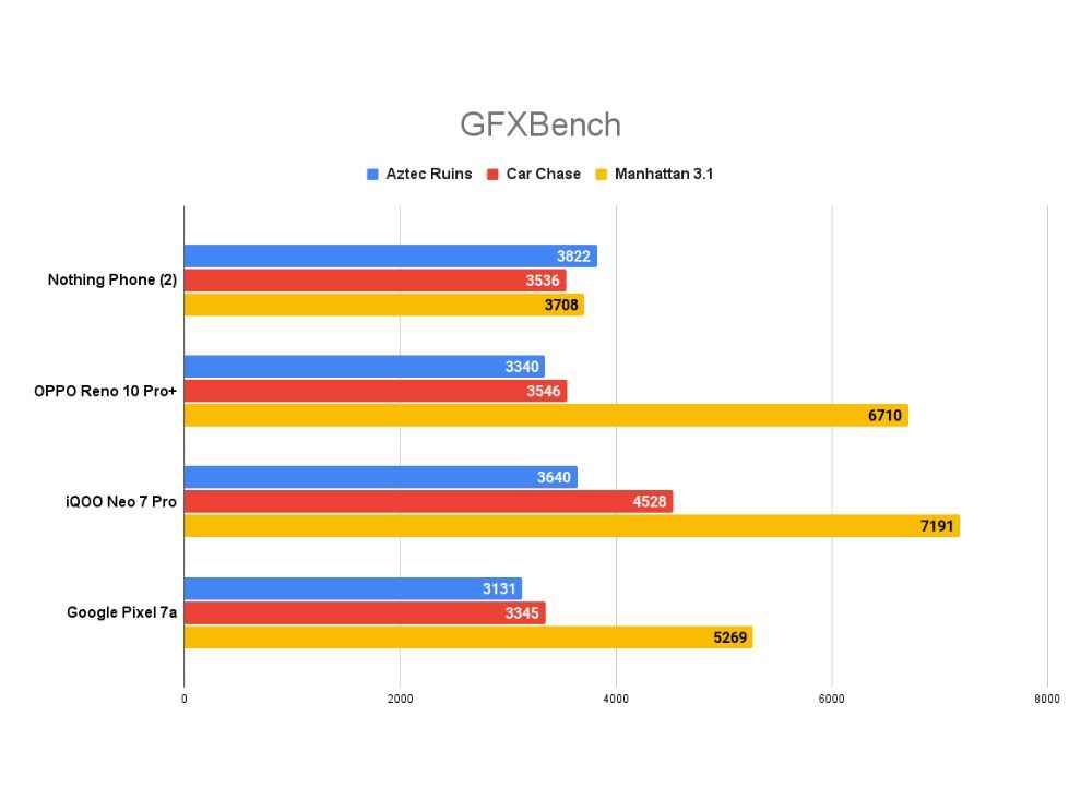
In GPU benchmarks, the phone scored 2,800 points in 3D Mark Wild Life Extreme, which is excellent. However, it couldn’t squeeze out great scores in GFXBench – particularly Manhattan 3.1 – where it lagged behind the competition. Nevertheless, real world gaming is smooth and lag-free on Very High graphics settings. The phone doesn’t support High Frame Rate gaming though (at launch), it is capped to 60 fps. We also ran the CPU Throttling Test and the phone throttled to 69 per cent of its peak performance in 15 minutes, which is common for phones with cooling systems. The phone got slightly warm when I ran this test, but it never got uncomfortably hot. So, the thermals and cooling is pretty impressive on this phone.
In real life usage, there are barely any hitches. In fact, there were no instances of bugs or app shutdowns like we experienced on the Phone (1) during launch. It was smooth sailing all the way. Additionally, the clean Nothing OS 2.0 is incredibly smooth and fluid. It is a slightly modified version of stock Android 13 and it looks and feels incredible. Nothing has also promised 3 years of OS updates and 4 years of security updates, which is not the best (that honour is reserved for Samsung) but good enough.
Nothing OS 2.0 allows for tons of customisation in terms of custom widgets, monochrome icons, Quick Settings widgets, and lock screen widgets. The UI also has large folders and larger single app icons. You can simply enlarge an app if you use it very often for easy access. Users can also choose between Nothing’s Monochrome UI or Original Google-like UI (with colourful icons). The Monochrome UI looks fantastic and Nothing has even introduced an app that will force all icons to adopt the monochrome look, which makes the phone look incredibly clean and tastefully-designed.
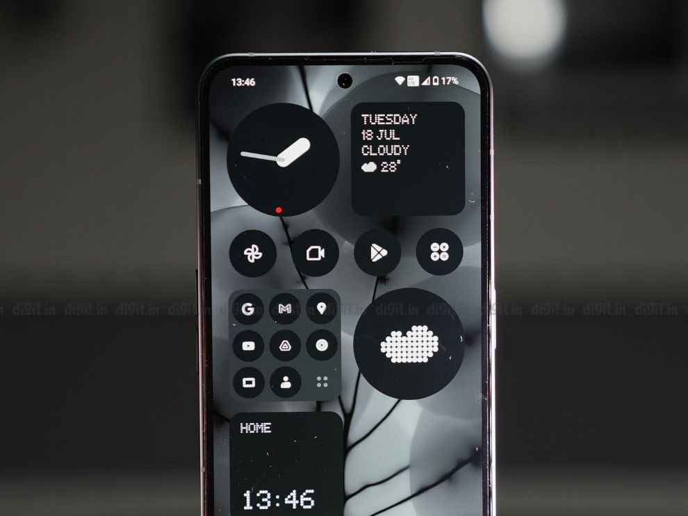
There’s no bloatware – only the mandatory Google apps, and some custom apps such as the Camera, Composer, Weather, Nothing X (for earphones) and Voice Recorder apps. I would also like to appreciate the haptics on the Nothing Phone (2). Possibly one of the best I’ve experienced. The feedback is pleasant and accurate to the point you’ve touched the screen. Fantastic stuff.
Nothing Phone (2) Review: CameraDespite sporting improved cameras, this is one of the weakest links of the Nothing Phone (2). The phone sports a 50 MP Sony IMX890 primary camera (with OIS and EIS) and a 50 MP Samsung JN1 ultrawide camera on the back. The ultrawide camera also doubles as a macro shooter. The selfie camera is a 32 MP Sony IMX615 lens.
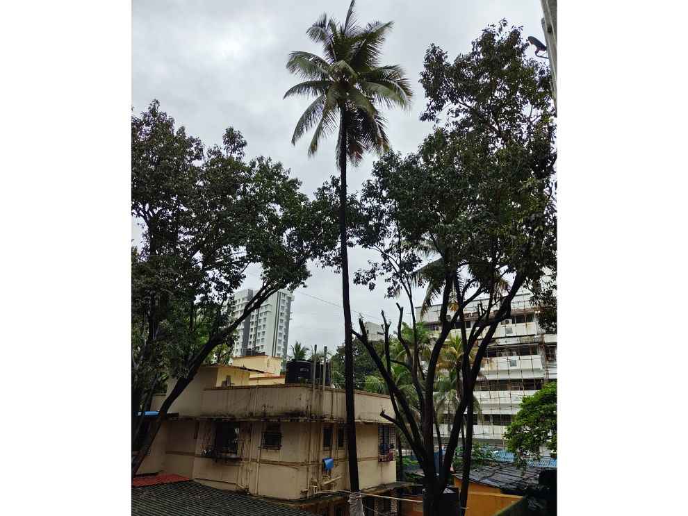
Now, I said this was the weakest link of the Nothing Phone (2) and that’s evident after you spend time with the Phone (2)’s camera after playing around with flagship offerings. Sure, the phone can take some amazing shots in daylight with plenty of detail, low noise, and good levels of sharpness. However, I always found the dynamic range to be slightly lacking, even in good lighting. I found that the details in shadows can get crushed quite often. Also, the colours are a touch too saturated and skin tones aren’t accurate to real life as well. Here are some camera samples, do note that they are compressed for the web:


There’s a 2x Super High Res zoom feature as well that takes some good shots with nice detail and sharpness. There’s a bit of oversharpening in some areas here though. Portrait shots from the main lens are mediocre. The edge detection isn’t the best and the skin tones aren’t accurate – at least for Indians. The bokeh looks pleasant though.
The ultrawide photos look good. Noise is low and colours match the primary camera. However, once again, the dynamic range is lacking. This camera supports autofocus which allows you to take some nice macro shots. The pictures have good detail and sharpness. Colours also look lovely. The 32 MP selfie camera’s results are decent with low noise and good contrast. The colours are decent and the dynamic range is quite good.
Moving on to low light, this mode triggers automatically and there’s no way to control it manually. A missed opportunity, in my opinion, since some photos end up looking dark even with Night Mode active. The photos are good enough in most cases, but we noticed some results looking quite soft and noisy. Definite room for improvement here.

As for videos, the phone captures up to 4K at 60 fps while the selfie camera is capped at 1080p at 30 fps. 4K videos look decent – there’s good contrast and dynamic range but colours could be better. The detail is also lacking. Footage also suffers from some unnatural shake motions when Action Mode is active.
Nothing Phone (2) Review: Battery LifeThe Nothing Phone (2) comes with an upgraded battery over the Phone (1) with higher capacity – 4,700 mAh vs 4,500 mAh. The chipset is also known to be extremely efficient and with AOD turned off, the Phone (2) delivered spectacular battery life results. In our 4K video loop test, the phone lasted a whopping 18 hours and 2 minutes, which is one of the best results at this price. The phone used up 4 per cent battery when playing Call of Duty: Mobile for 15 minutes and 7 per cent battery when running GPS for an hour.
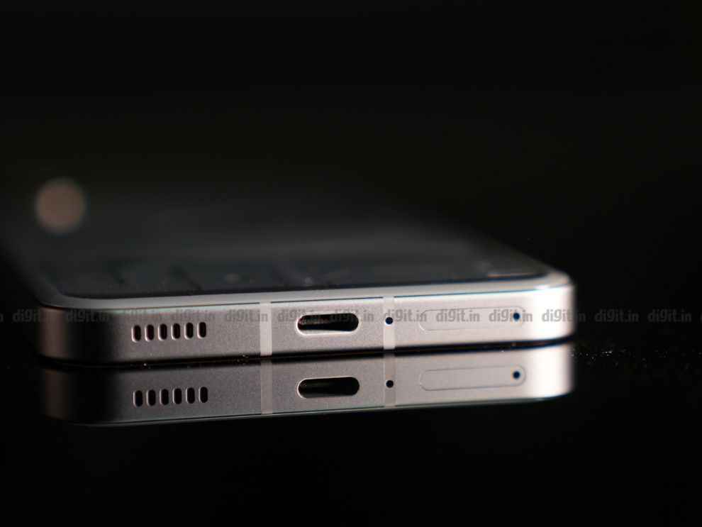
The Phone (2) also supports 45 W wired fast charging which powers the phone from zero to hundred in 57 minutes, according to our tests. Not the fastest, but a decent enough result. There’s also support for 15 W wireless charging and 5 W reverse wireless charging (which is great for charging TWS earphones with Qi charging support).
Nothing Phone (2) Review: VerdictThe Nothing Phone (2) is truly something special. It has taken a phone that was essentially all-looks-no-substance and turned it into a well-rounded device with looks and utility to match. Not just that, Nothing OS 2.0 is possibly one of my absolute favourite mobile phone operating systems – it looks distinguished, classy, and clean while being fluid all the way through. The performance has improved vastly and battery life is superb as well. Now, for the price tag of ₹44,999 going all the way up to ₹54,999, the phone may seem overpriced to some. The Snapdragon 8+ Gen 1 is present on much cheaper phones such as the iQOO Neo 7 Pro and the camera stack is nothing to write home about.
However, Nothing has charged you a premium for the experience, which, in my opinion, it delivers in spades. The experience is fluid and refined with no bloatware, the once-gimmicky glyphs have some actual functionality now, and there are other niceties like the premium body and design. Of course, there are other options in the market – the iQOO Neo 7 Pro 5G for pure, unadulterated performance at a lower price and the OnePlus 11R (review) for its all-rounder abilities. You could also get the OPPO Reno 10 Pro+ at ₹54,999 for better camera performance. Nevertheless, we still maintain that the Nothing Phone (2) is a solid option – one that’s quirky, has instant recognisability, and an excellent software experience.
from Mobile Phones Reviews https://ift.tt/xQzlGVN

No comments:
Post a Comment