So the Moto Razr 40 Ultra is, hands down, one of the best flip phones out there. I absolutely love how Motorola has done the outer display and this is an implementation that actually will make people flip open their smartphones much less, resulting in better longevity. But then again, if we are talking about longevity, Motorola doesn’t give you the most amount of software updates but at least your phone will last enough to see all the updates.
So Moto Razr is a name all of us resonate with flip phones. The company Motorola has been the champion of flip phones even before the smartphone era, with the famous Moto Razr flip phone that was all the rage back in the 2000s. Now, in the more recent times, the company has tried to go back to its roots with the influx of foldable displays in the last three or four years, bringing back the iconic “Razr” name in a more futuristic shape and form.
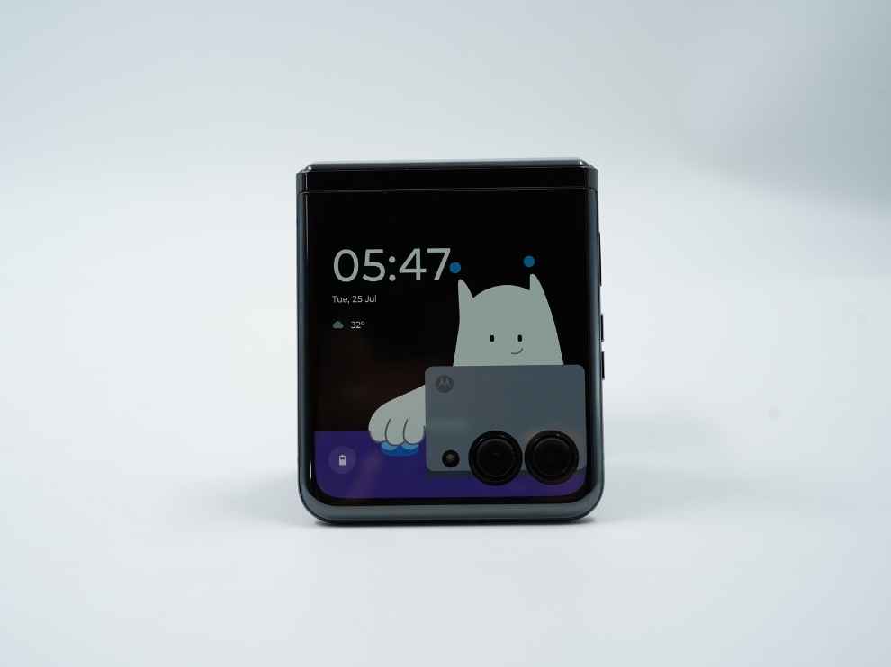
This year, the Moto Razr series seems to be more refined than ever, riding largely on the incremental leap we have seen in flip smartphones this year with the larger outer displays that do a lot more. Among this influx of the bigger outer displays, the Moto Razr 40 Ultra has the biggest 3.6-inch AMOLED display that does pretty much everything you can do on a smartphone. But does having a huge outer display make the Moto Razr 40 Ultra the best flip phone out there? Let’s find out in this review:
MOTO RAZR 40 ULTRA: DESIGNSo design is where the Flip form factor trumps the more traditional glass slab smartphones, and every flip phone so far has been more of a style statement than a gadget so far. However, there are moving parts and that isn’t always good in terms of the design. But we will get to functionality later, first let’s just talk about how the Moto Razr 40 Ultra looks and what we like about the smartphone.
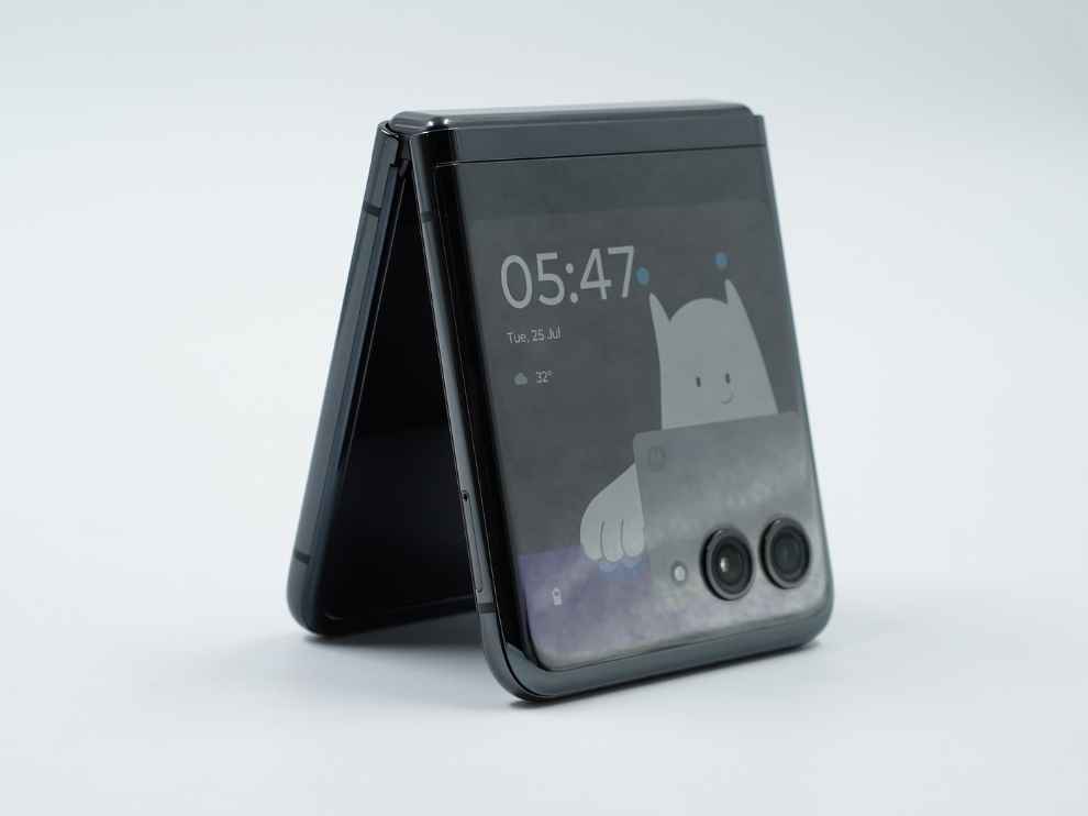
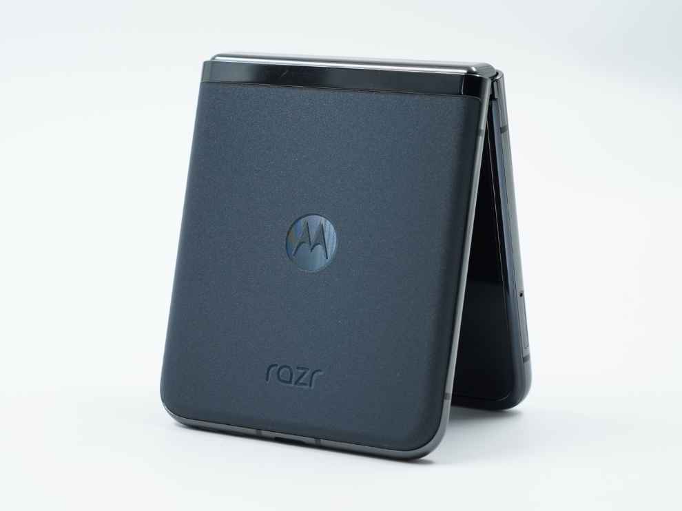
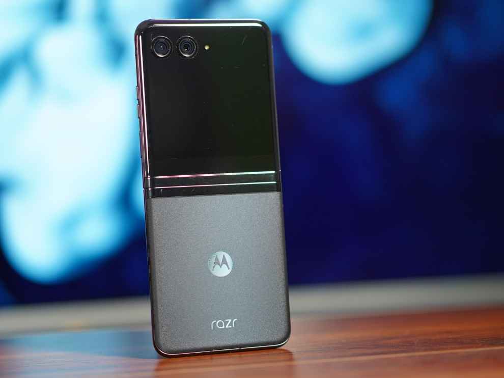
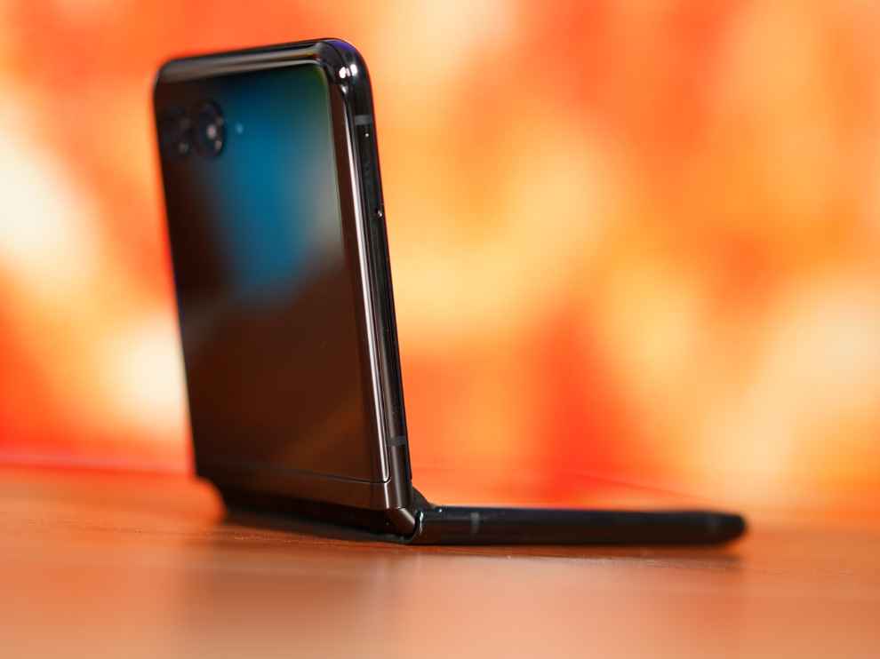
The first thing that catches your attention is the front or outer display, which is a 3.6-inch AMOLED panel with a hole-punch implementation that houses the two primary cameras, along with the LED flash. From the front, the smartphone looks very futuristic. We only see a display with the cutouts for the camera, which looks nice. At the back, we get two options - glass back for the black colour and vegan leather for the red colour. The back is plain, we don’t get much there, but the smartphone looks and feels super premium in the leather back panel. The glass back also feels very nice and premium, but I’m more of a leather back person.
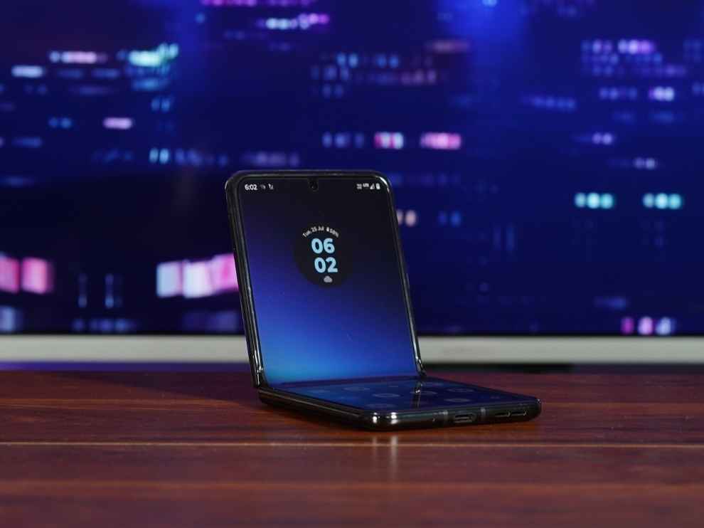
Once we flip the screen open, we get a nice 6.9-inch AMOLED display with a rather tall aspect ratio, which makes the smartphone quite unusable with one hand. Here also, the front camera is placed in the middle and we get a nice curved metal frame on all sides.
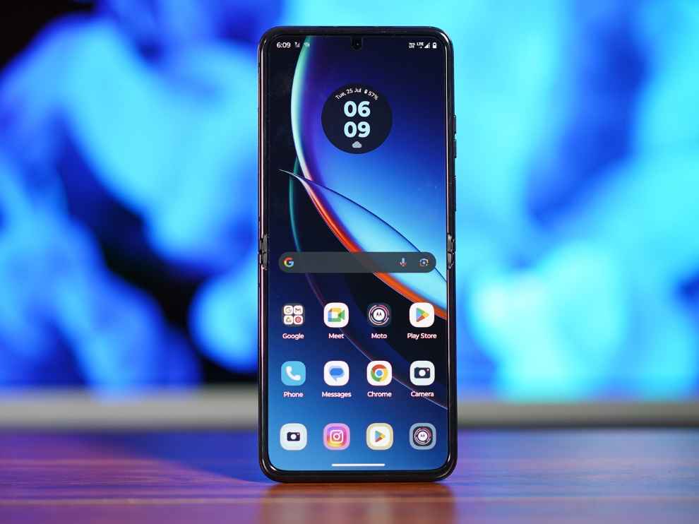
One thing I didn’t like about the Moto Razr 40 Ultra is that the smartphone doesn’t open completely flat. When we open the smartphone, it appears a bit bent, which is a bit of a bummer. And if you were wondering, the crease is prominent and you will notice it at first. Over time, we’ll know if this turns into an air bubble, but for now, the hinge has been designed in a way that won’t let dust in. The power button and the volume rockers are placed on the right side of the frame, with the fingerprint sensor integrated into the power button itself. The hinge is good, and Motorola has been able to close the gap between the two flaps so that is good. However, I didn’t find the hinge to be very smooth, since the opening and closing of the smartphone isn’t very smooth and there are two major stops, one around halfway, and one on final stop, where the smartphone opens completely. While I was using the Moto Razr 40 Ultra on its own, this seemed fine, but the moment I got my hands on the Samsung Galaxy Z Flip 5, I understood how good this could have been. Even when closed, the Moto Razr 40 Ultra’s flaps have a bit of a play and move around just a little, so that’s not great.
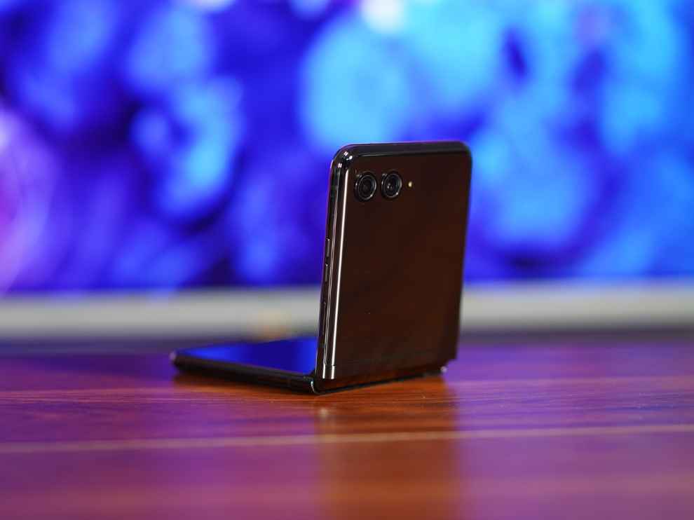
Overall, this is a very futuristic design from Motorola. It looks and feels super premium in your hands, and the outer display implementation is very futuristic with the full-screen display. I’m not very impressed with the hinge and the opening and closing isn’t as smooth as I first thought, but there is no gap between the two parts of the fold, so that is good.
MOTO RAZR 40 ULTRA: DISPLAY(s)Coming to the displays, first let’s talk about the outer display. This is the first time we are seeing this big a display on a flip smartphone. We get a very crisp 3.6-inch AMOLED display with a 144Hz refresh rate, something we don’t even see on flagships these days. This display is also bright enough to be used in all kinds of bright conditions and very nice in terms of sharpness. We weren’t able to measure the colour accuracy and the brightness on this display, but it seemed brilliant for a secondary display. Plus, you can do a lot on this display, so that is something that made me just fall in love with this outer display (more on this, later).
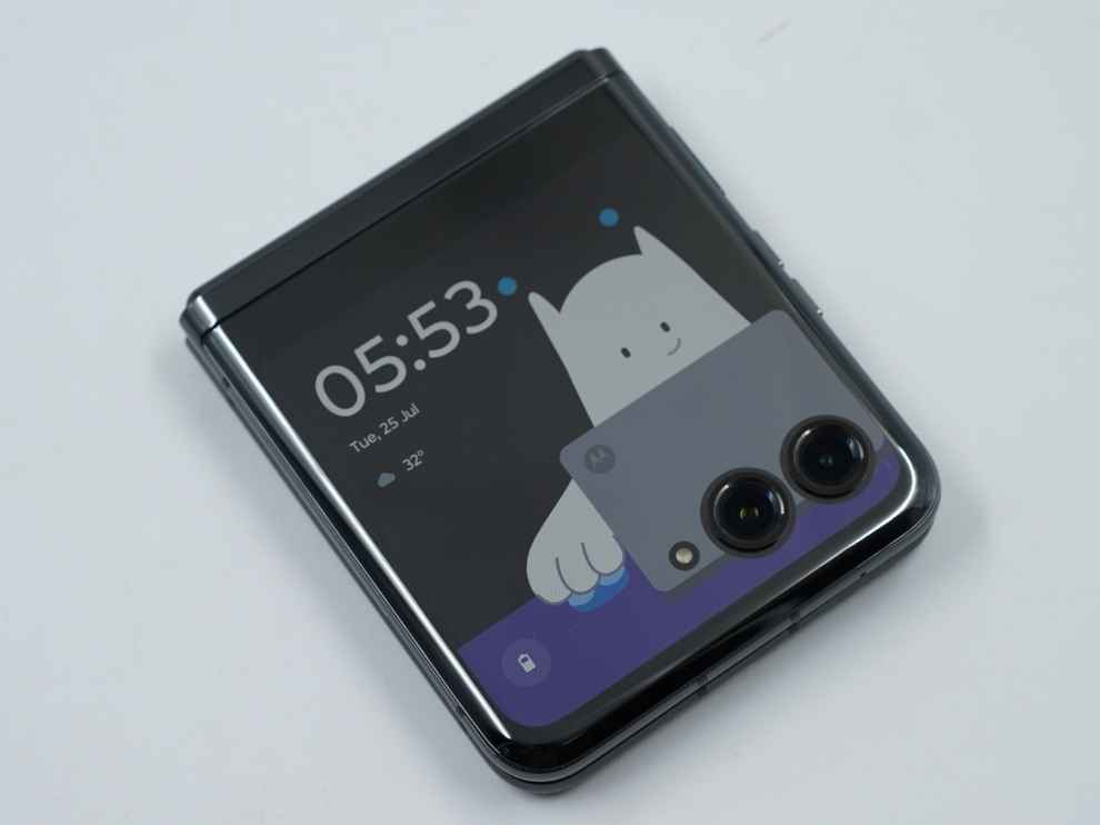
Coming to the main display, let’s first get the biggest concern out of the way. Yes, the crease is prominent enough that you will see and feel it very well. Outside of that, the Moto Razr 40 Ultra has a nice flexible AMOLED display with an FHD+ resolution and a gaming PC-level 165Hz refresh rate with LTPO. This is one of the highest refresh rate on any smartphone, and the result is an ultra smooth scrolling and browsing experience! Like this display feels as smooth as it gets, and I absolutely loved swiping my way through this screen, just the crease got in the way quite a lot.
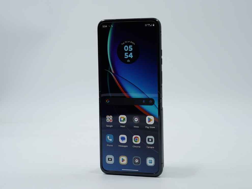
The main display on the Moto Razr 40 Ultra, however, has a very tall aspect ratio, which not only makes the smartphone unusable with one hand, it also brings black borders around the display during gaming or watching videos.
In terms of brightness also, this display is very good, but not the best. Using a Lux Meter, I tested the maximum luminance on the Moto Razr 40 Ultra to be 773 nits, and the minimum on a plain white screen came out to be 4 nits. This is good, but we get similar or better results in some mid-rangers of today, let alone flagships.
MOTO RAZR 40 ULTRA: PERFORMANCEPerformance and software is where the Moto Razr 40 Ultra impresses me the most. Now, the smartphone isn’t bleeding edge by today’s standards. We get a generation-old Snapdragon 8+ Gen 1 chipset with 8GB of RAM, which sounds a bit less for a flagship of 2023. However, the smartphone does everything as well and as smoothly as any other flagship out there. Now, the focus here isn’t performance but to offer the best flip or premium experience out there and to offer that, these specifications are more than enough.
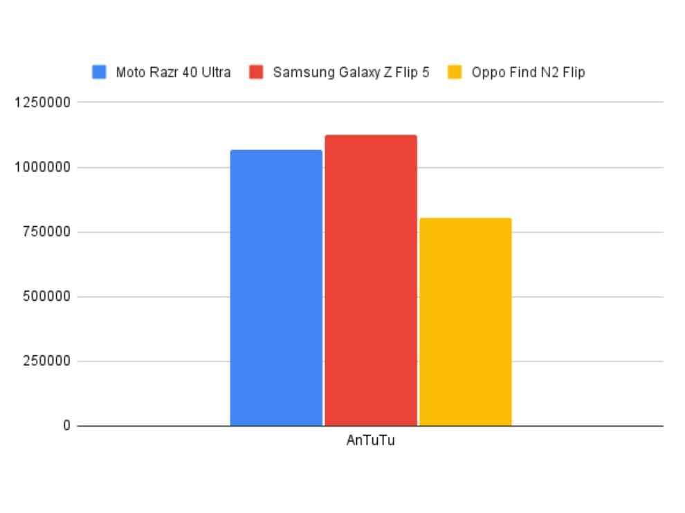
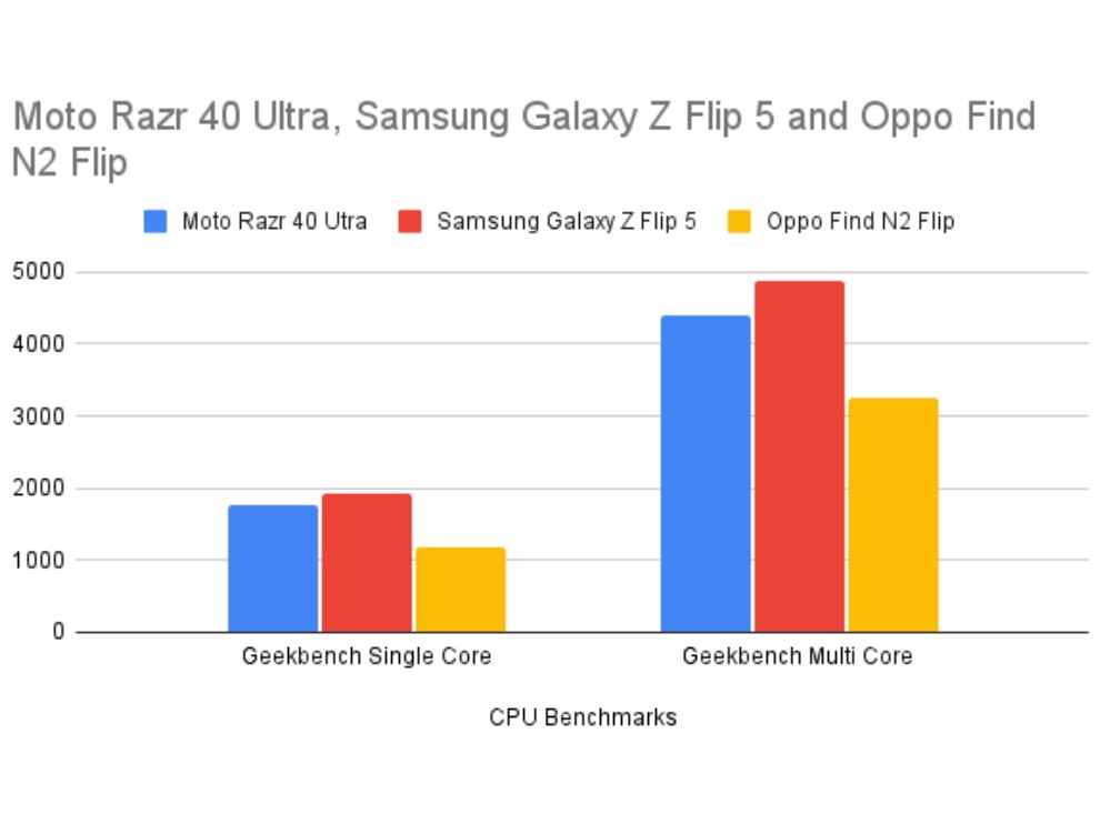
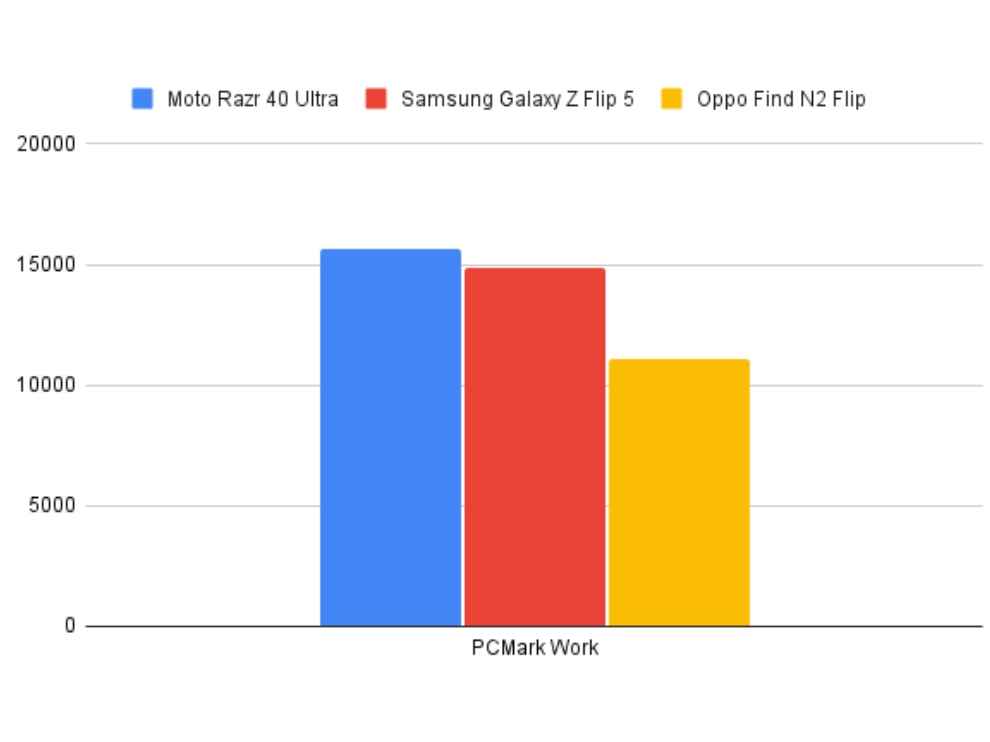
For the sake of numbers, the smartphone put out a score of 1068229 points on AnTuTu. On Geekbench, the smartphone was able to put out a score of 1774 in the single core test and a score of 4405 in the multi core test. In other CPU benchmarks like Mobile XPRT 3 and PCMark Work, the Moto Razr 40 Ultra was right up there with its competition, and even beat the Samsung Galaxy Z Flip 5, which comes with a newer Snapdragon 8 Gen 2 chip, in the PC Mark Work test.
In GPU-based benchmarks also, the Moto Razr 40 Ultra performed very well. The smartphone was able to hold its own in the gaming and performance department, and showed us very good results when it comes to pushing frames and running heavy games or tests.

Now, we do CPU and GPU tests in every review and here, we are also going to focus on the software. Because for a flip smartphone to work, or for a foldable form factor, most of the experience is made or broken by the software experience. Here, we get a very good close-to-stock Android experience with Motorola’s My UX Android skin so that is great. I am more of a stock Android person, so having no bloatware or unnecessary permissions and pop-ups work well for me. But while we are at software, I would first like to mention how well Motorola has done the outer display. The smartphone’s 3.6-inch cover display can pretty much do anything. We get several screens to scroll through all the widgets, apps, games, the dialer, and other stuff. We get special apps and widgets for Spotify and Google Maps, which function absolutely smoothly. Further, there is an app menu or an app drawer right in the outer display. Here, by default we get only a few apps on the screen, but there is an option in the settings to pretty much bring every app to this drawer.

There are a few apps that are not supported on this small display and for those apps that do run on it, compatibility is an issue since these apps are made for big screens or a normal smartphone screen. Nevertheless, just the ability to allow all apps and notifications on this display makes the Moto Razr 40 Ultra a very tempting option to buy, since this kind of software implementation is what will make people open or unfold their smartphones more. During my testing, I was even able to run benchmark tests on this 3.6-inch display and even played heavy duty games like Call of Duty Mobile and the likes.
In GPU benchmarks, the outer display was able to put out more than the main display since of course, it is a smaller screen and there are less frames to push. Impressive stuff.
MOTO RAZR 40 ULTRA: BATTERYComing to the battery, here also the Moto Razr 40 Ultra doesn’t seem as impressive on paper. We get a 3,800mAh battery with support for 33W fast charging. Now, for someone in the Android flagship space, those numbers will seem miniscule as against the 5000 or 6,000mAh batteries we have seen on flagships. However, since this is a different form factor and with the tight space, the company was still able to fit a bigger battery as compared to the last generation.
The battery backup is good. The Moto Razr 40 Ultra lasted a good 742 minutes in our video loop test, which is more than 12 hours and 20 minutes. That is superb backup for only a 3,800mAh battery and on a flip smartphone. While playing Call of Duty Mobile, the smartphone only lost 6 percent of the battery. Further, one hour of GPS navigation made the smartphone lose about 8-9 percent of the Moto Razr 40 Ultra’s battery, and 30 minutes of streaming a video on YouTube on the highest-possible resolution drained only 4 percent of the battery. As we saw, the battery backup on the Moto Razr 40 Ultra is very good, despite a rather small battery on paper. The charging is also just okay. The 33W fast charger took more than an hour to charge the smartphone fully. From 0 to 100 percent, the Moto Razr 40 Ultra took just over 64 minutes, which is decent.
MOTO RAZR 40 ULTRA: CAMERAIn terms of camera, we get a dual rear camera setup on the Moto Razr 40 Ultra that includes a primary 12-megapixel shooter and a 13-megapixel ultra-wide angle lens. The camera performance out of these is very good. The camera is another example of the Moto Razr 40 Ultra not being too impressive but still taking on competitors with much more bulk. The camera performance on this smartphone is very good. I like the colour representation on photo clicked with the main sensor. There is no pixel binning here, so the images are mostly accurate and final results are consistent with what we see in the viewfinder, so that is good.

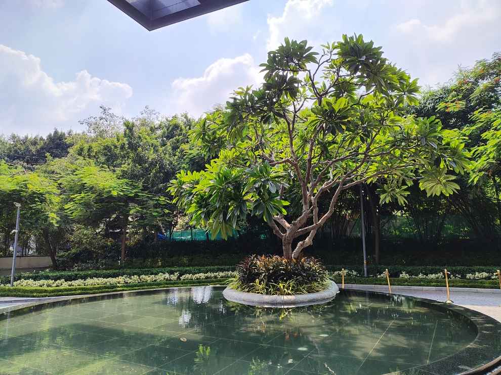


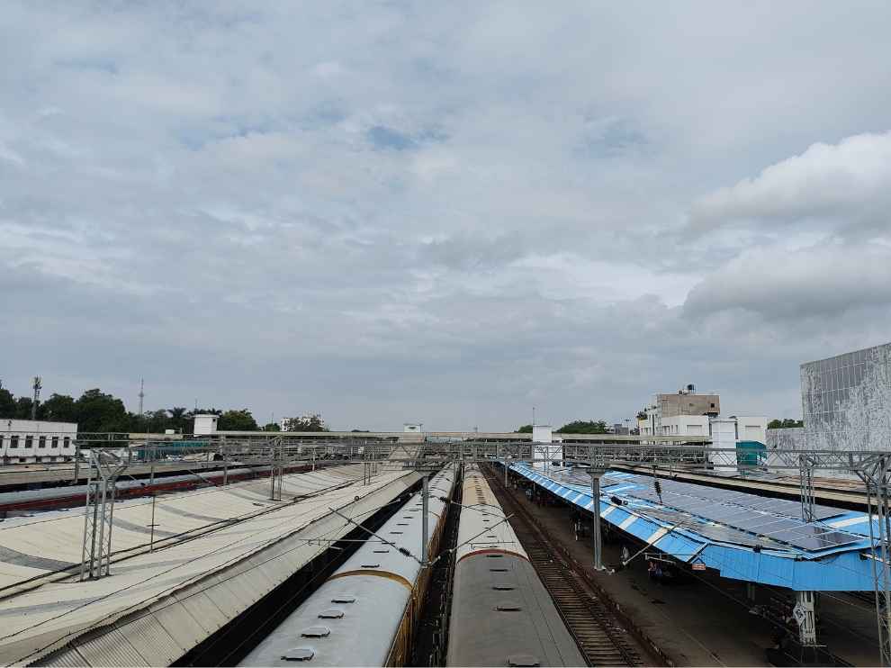

The photos are a bit towards the saturated side in terms of colour, but the details are brilliant. The dynamic range is also pretty good and I was able to take some very good scenic shots with this camera. Even in low light, the Moto Razr 40 Ultra’s camera performs well, but it’s nothing extraordinary.
The portraits are also nice, but I didn’t find anything great. Like this smartphone does edge detection and background blur well but usually, flagships make me want to click more and more single subject images in portrait. And with the Moto Razr 40 Ultra, not once did I prefer using portrait mode over the normal photo mode.
MOTO RAZR 40 ULTRA: VERDICTSo the Moto Razr 40 Ultra is, hands down, one of the best flip phones out there. I absolutely love how Motorola has done the outer display and this is an implementation that actually will make people flip open their smartphones much less, resulting in better longevity. But then again, if we are talking about longevity, Motorola doesn’t give you the most amount of software updates but at least your phone will last enough to see all the updates.
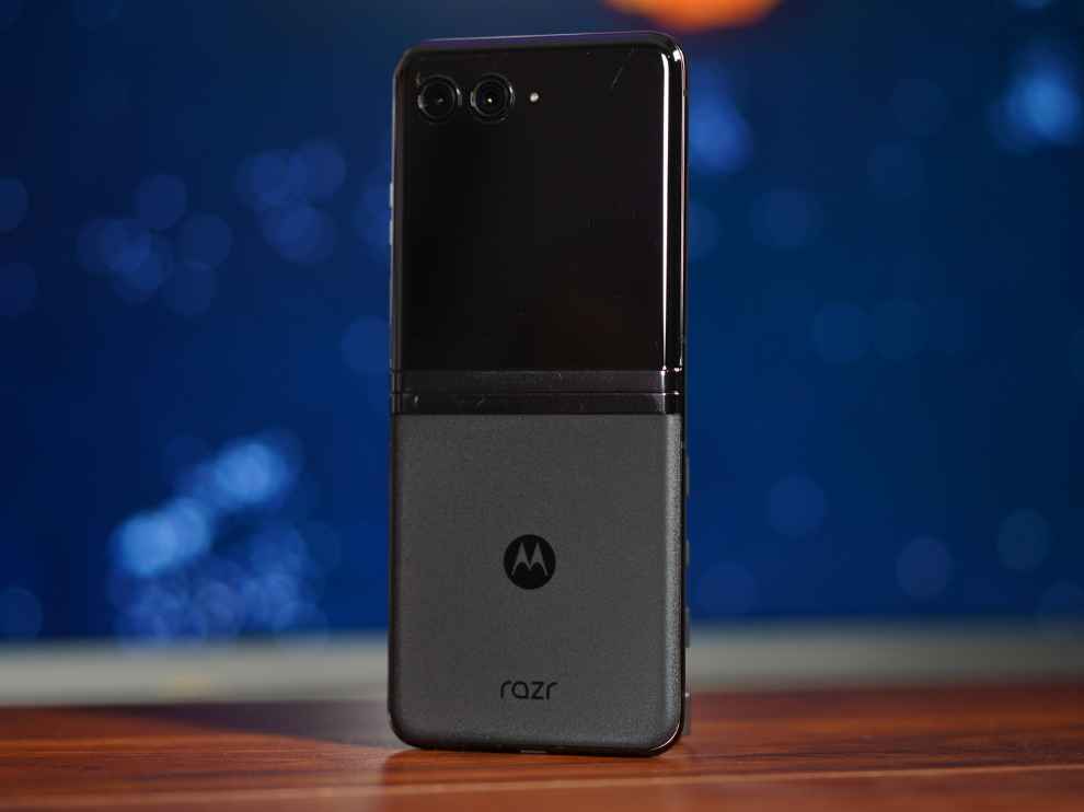
Yes, there are rough edges here and there, like the hinge isn’t as sturdy or smooth as the newer and more expensive Samsung Galaxy Z Flip 5. I don’t like the fact that there are two major stops and that it is super difficult to open with just one hand. Furthermore, there is a bit of a play or wobble when the smartphone is closed so that fit and finish could have been better.
Overall, however, this smartphone does what you want it to do, and does it well. Yes, as a complete phone the Samsung Galaxy Z Flip 5 could be better, but the outer display is the Moto Razr 40 Ultra’s main attraction. If we think of it, in the early days of touchscreen smartphones, a smartphone’s main display was this big, with now the secondary displays being bigger. And with the Moto Razr 40 Ultra, you can actually do as much as your smartphone in the early days did.
from Mobile Phones Reviews https://ift.tt/DiNwC7v

No comments:
Post a Comment